
Search the wiki
The Grey, the Chrome and the Macbeth Chart

Introduction and Overview
I just want to give a huge shout out to our collaborative partner Clear Angle Studios for supporting CAVE Academy and allowing us to use a number of their images throughout this lesson.
Before we jump into things, let’s kick off with a general overview of the reference kit.
We have 3 primary objects that we tend to use as VFX, animation and games reference:
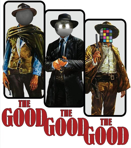
- The Grey Ball
- The Chrome Ball
- The Macbeth Chart
When it comes to this set, we are not talking: The Good, The Bad and the Ugly. We are talking: The Good, The Good and “Thank Goodness you Captured the Macbeth Chart”.
Overall, the reference allows supervisors and leads to check that all artists are working to an initial calibrated setup. This will allow for consistency across the assets and for shots. What you don’t want in a production is multiple artists using their own individual setups when creating a series of assets that will need to come together. All shaders should be reviewed within a known fixed context. The same goes for textures, models and so on.
There are a number of teams that will want to pick up the reference. Primarily, this would be Surfacing (Texture, Look Development and Groom), Grading and Lighting. Let’s break down each (and we’ll dive into more detail as we explore the reference below):
- Surface > Texture: For the Texture team, they’ll be interested in having the Macbeth chart as this will allow them to white balance and expose their photography reference consistently.
- Surface > Look Development: For the Look Dev team, they’ll be able to use the Grey, Chrome and the Macbeth chart to set up their lighting environments and ensure they are working in a colour controlled neutral space. They’ll also be able to white balance and expose any additional HDRIs.
- Surface > Groom: The Groom team shout be using the same setup as the Look Dev folk, so the shading of the Groom responds and is calibrated using the same lighting as the main body of the asset.
- Grading: This is extremely valuable when neutralising a sequence that comprises of multiple cameras and due to environmental lighting changes (outdoor shoots). Using the Macbeth, shots within a sequence can be white balanced and exposed to be consistent.
- Lighting: For the Lighting team, they can use the Grey, Chrome and Macbeth chart to calibrate their HDRIs and match to the plate photography. It is important that the reference has also been shot using the primary shoot cameras (for example, the ARRI, or RED, or Black Magic) as you’ll need to have reference of what you should be matching to.

If you are looking for a more detailed step-by-step breakdown on all things onset related, you can check out our courses on the topic here:
- Onset Data Acquisition 1001
- Introduction to Cameras and Lenses 1001
- Shooting HDRIs and Panoramas 1001
- Shooting Texture and Look Development Reference 1001
And lastly, before we dive into the nitty gritty, please do remember that capturing this data is no easy task. Life onset is extremely fast paced, so if you don’t get any fancy reference, think about what you could use in plate photography to help you decipher the shot. Maybe a nearby wall is close to being white, so you could use that for grading. Or maybe you can see some useful info on the reflections of a car window.
Being able to problem solve from what you have is an extremely important skill, so do work on that. But…if you do get the fancy reference, make sure to give you friendly neighbourhood onset folk a big “THANK YOU“. They’ll appreciate it for sure 😉

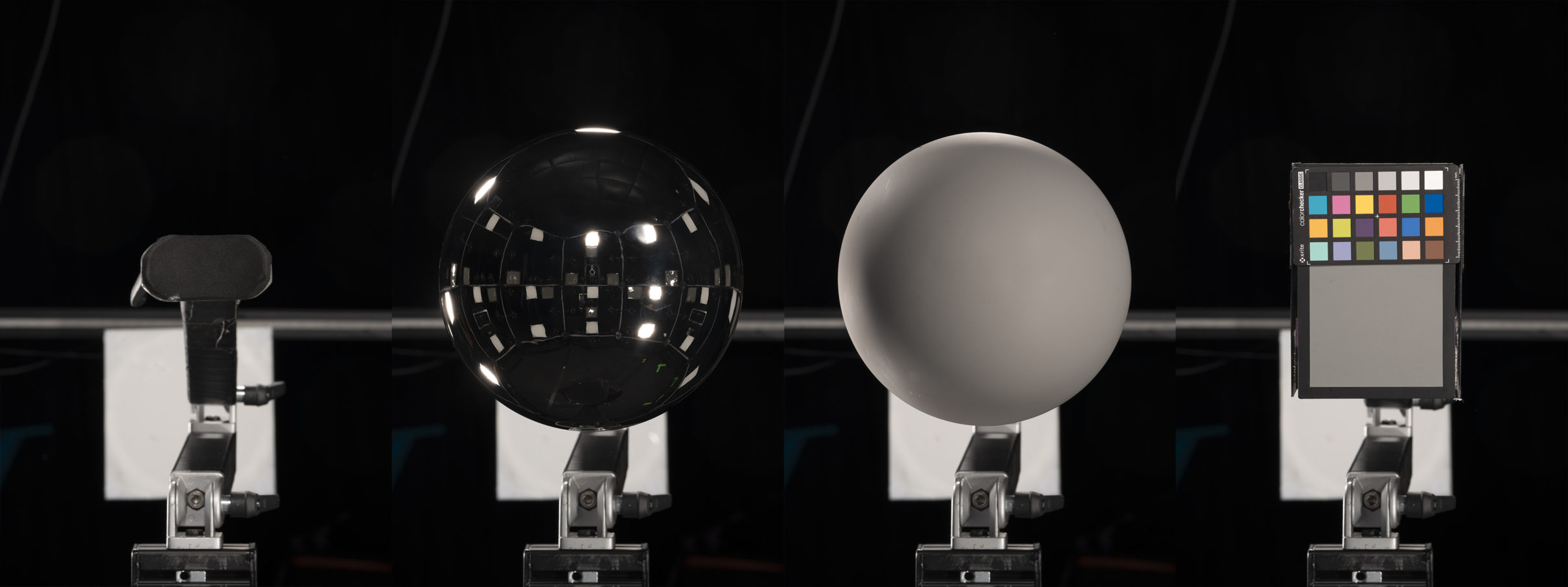
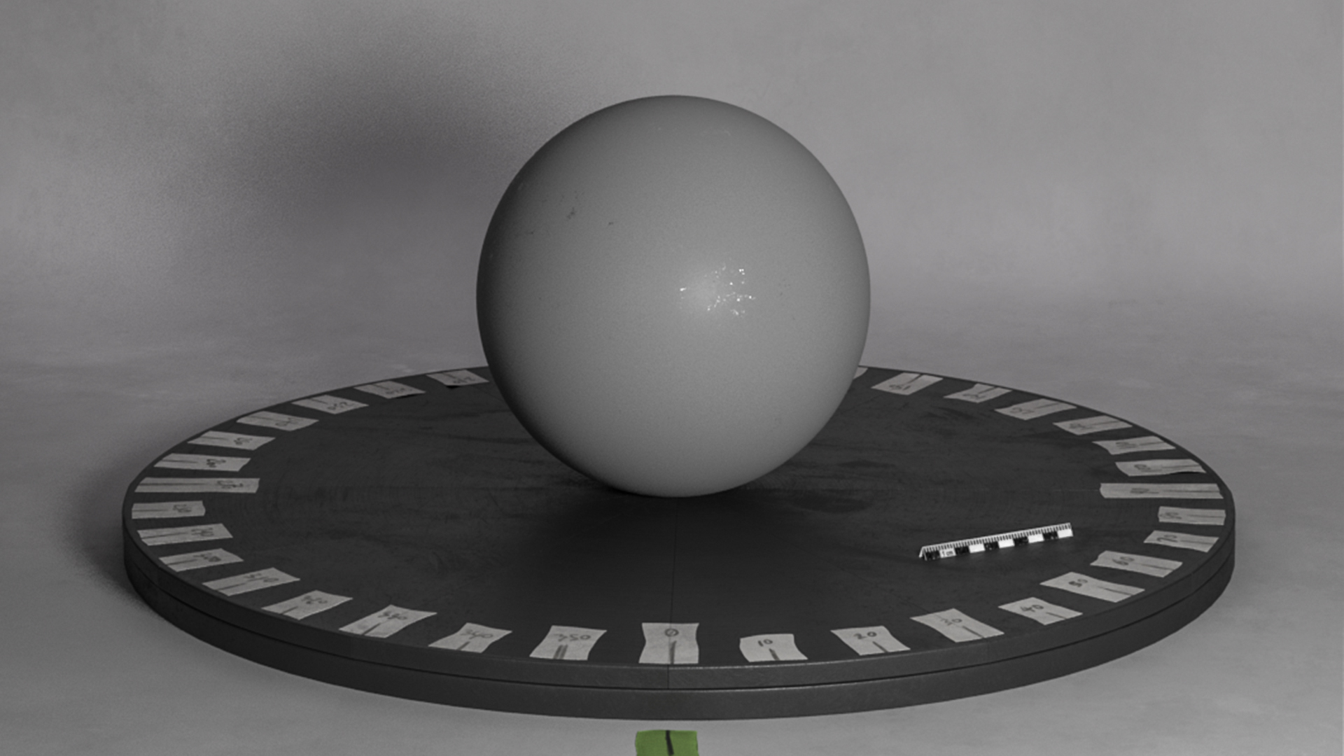
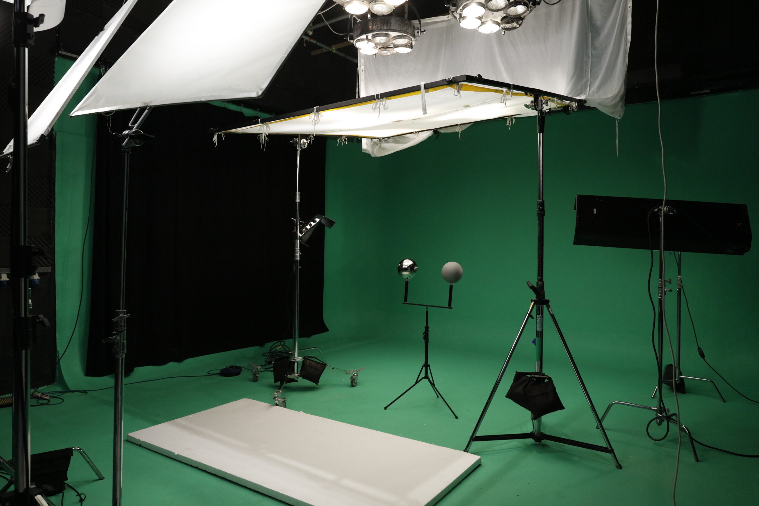
The Grey Ball
So we begin with the Grey ball. But ask yourself, is it really grey? Is it mid grey? Is it leaning more towards the blue side of the spectrum? Or maybe towards the red?
When someone pulls out a grey ball, our eyes will naturally fill in the blanks and say: “Ahh, a grey ball!”. The same goes for a white piece of paper. You have a gazillion (well, maybe not a gazillion) different tones of white and unless you pop them altogether and compare them, your brain will more than likely simplify things. So, unless your Grey ball has been well crafted and painted using a very fancy grey paint (from Rosco for example), it might be slightly off. General purpose paint from a department store will not have a very pure pigment, so it won’t be as reliable as the Macbeth Chart.
However, you just need to be aware of this and tweak your digital Grey shader to compensate. Or if you have the time and resources, shoot your look dev reference kit under polarised and cross polarised light to capture the surface colour more accurately.
But we digress. Let’s get back to the ball itself and ask ourselves: What is the Grey ball for? Well, primarily, it allows us to assess the following:
light direction
intensity
shadow
But it is important to note that this is just from the position you are shooting the ball from. Move the Grey ball and it will respond differently, as it should. But for that particular point in space and time, you have captured an extremely valuable moment of reference.
Like the Chrome ball, it is also very easy to create a digital Grey ball, so getting a look dev or lighting scene up and running can be quickly established.
This Grey ball used by Clear Angle Studios is very grey by the way. It’s an example of a fancy grey ball 😉
The Chrome Ball
Now we move onto the Chrome ball. Everyone loves the Chrome ball.
People in the streets will walk up to the Chrome ball. They’ll want to touch it. If you are not looking, they will touch it. Don’t let them! Don’t let them near your balls. You need to keep them clean. Smudge free.

Plus, they’ll want to take selfies using the Chrome ball. And selfies from a Chrome ball are the best selfies, EVER!
However, this is “unacceptable!” Why? Because if you are onset, they’ll capture everything being reflected. And if the project you are working on is a secret project, then you’ll be in big trouble if they release that pic into the wild. Aunt Edna may have had a thing against capes, but when it comes to the Chrome ball, its:
No selfies!

But what is the Chrome ball useful for? Other than the best selfies ever?
Reflection

Using the Chrome ball, you get to have a clear picture on what is going on onset at that specific moment in time. You have info on where the lights are, where the camera is, what the set looks like. It does not tell you everything mind. For example, sometimes lights will be hidden behind other objects or bounced off walls, so acquiring additional photographic reference of the set is still recommended. But for how things look in a specific location, it is gold (well, chrome).
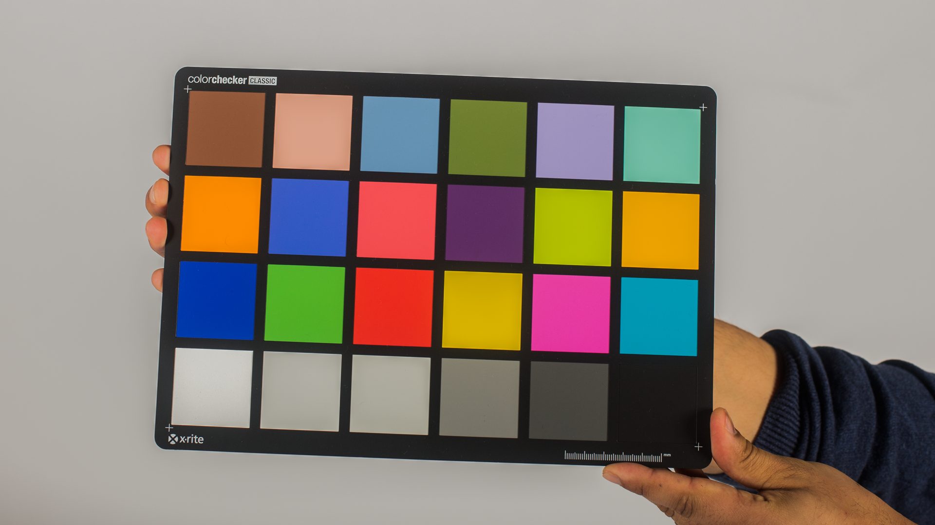
The Macbeth Chart
Now we come to the Macbeth chart.
Nothing to do with kings and witches. Here is a snippet of info about the chart from Wikipedia:
The ColorChecker Color Rendition Chart (often referred to by its original name, the Macbeth ColorChecker or simply Macbeth chart) is a color calibration target consisting of a cardboard-framed arrangement of 24 squares of painted samples. The ColorChecker was introduced in a 1976 paper by McCamy, Marcus, and Davidson in the Journal of Applied Photographic Engineering.
The chart’s color patches have spectral reflectances intended to mimic those of natural objects such as human skin, foliage, and flowers, to have consistent color appearance under a variety of lighting conditions, especially as detected by typical color photographic film, and to be stable over time.

So, how should we use the chart without freaking things out within our VFX workflow? Primarily by only using it to neutralise the plate. That means to:
- Set the exposure
- Set the white balance
Through the chart, we can consistently apply exposure and white balance tweaks to our footage, texture photography, panoramas, and HDRIs to help bring them into alignment. It is, without a doubt a huge timesaver and removes a heck of a lot of guesswork, although some artistic tweaking may be required.
However, due to a number of factors, it SHOULD NOT be used for colour-correction. For more information on using the colour chart, I highly recommend you read the following by Thomas Mansencal:
-
The ColorChecker Considered Mostly Harmless – This post will be about colour rendition charts, e.g. X-Rite ColorChecker Classic, their usage and its dangers. It was a long time coming and some discussions accelerated the authoring.
I also recommend working through this paper by C. S. McCamy, H, Marcuc and J. G. Davidson:
- A Color-Rendition Chart (pdf) – Journal of Applied Photographic Engineering, Volume 2, Number 3, Summer 1976
If I had to sum up what the Macbeth chart allows for in a single word (and I know I’ve said this word a lot in this doc), it is:
CONSISTENCY
The Macbeth chart can act as our ground truth for the shoot setup. But just be wary that how you angle the Macbeth chart is important. It is very easy to catch the Macbeth at an angle and this might pick up some glare.

Also – just like you should not get your grubby fingers all over the Chrome ball (or the Grey ball in fact), DON’T cover the Macbeth chart with your grubby fingers. We don’t need your fingers to expose/white balance the shot or our texture reference, we need the colour samples behind your grubby fingers. And we don’t want your grub on the samples either. Stick to the edges of the Macbeth chart when handling the Macbeth chart.
How the Reference Responds to Light
Here we will look at how the Grey, Chrome and Macbeth charts respond to light.
Something that I hear often from artist (both students and professionals) is:
“My Grey ball does not look grey. It has lots of green at the bottom.
And my Macbeth chart colours look funny.
I tweaked the shaders and now it all looks stupid. Nothing is working. It’s all wrong, wrong, wrong 🙁 “
So I’ll look at their scene, I’ll sigh, and then say:
“Yes, you are right. Your grey ball looks quite green from the bottom”.
But then I’ll follow up with:
“But how else do you expect it to look? You are using a HDRI that was taken in Regents Park. A Park covered in green grass. Go and take a grey ball and a white ball, and stand in Regents Park with them. Guess what, light bounces around. Welcome to the real world!”
I don’t actually respond to anyone like that by the way 🙂

So to summarise, your reference will respond to your environment. And this is key. This is the info you need to capture. You are capturing how these known objects respond to light in a specific moment in time and space. Don’t mess with your digital shaders to try and compensate what the light is doing. Build known digital shaders, created in a controlled environment, and then let them respond to light as they should.
And be observant of how the real world works and how real-world objects respond to real-world lights. The more you do that, the more believable your CG will be.

Planning How you Position your Reference
Before you hit the set, take some time and consider your requirements and how you’ll go about shooting your reference.
Whether you are on a film set or in a controlled lit environment for look development, it is important to capture your reference in context. I generally tend to use one of the 2 scenarios below:
- Capture from the position of where the CG asset will go (so we have an understanding of the lighting in that particular point in time and space)
- Capture from a position that gives me the most information about the environment and the lighting (for example, the middle of the shoot space)
If I know that the CG asset will be moving through different positions in space, I’ll try to capture the reference from those positions too. For example, maybe Iron Man is going to walk from one side of the room to the other. If so, it would be useful to capture the reference at three different points along that path. And through the main camera, you’ll want to film the reference going through the same motions.
One thing I would recommend not doing is: setting up your lighting for your asset, randomly positioning your balls somewhere else, and then adding additional light to make them look ‘evenly’ lit. That kind of defeats their purpose, which is to visually illustrate how things look within the lighting setup where the asset is.
If you do want to position your reference in the bottom left corner of your render, then I would suggest you render out the reference from the correct position, and then in a package such as Nuke, cutout and composite the reference on top of your shot. More of this is explained and presented below under ‘Using the Reference in Post‘.
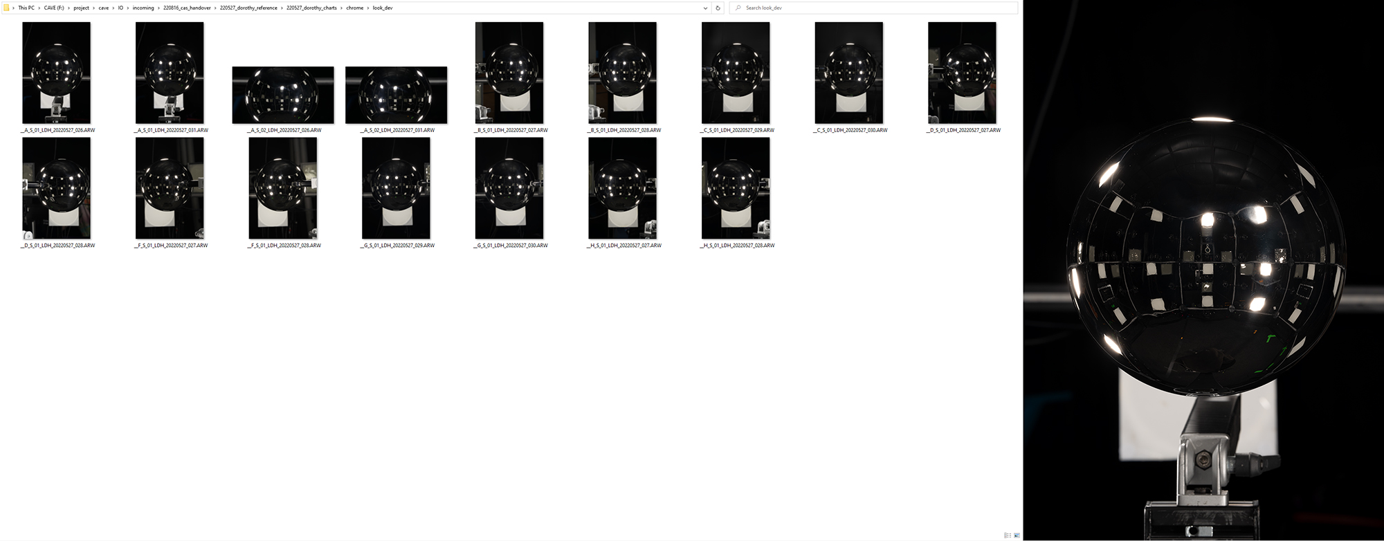
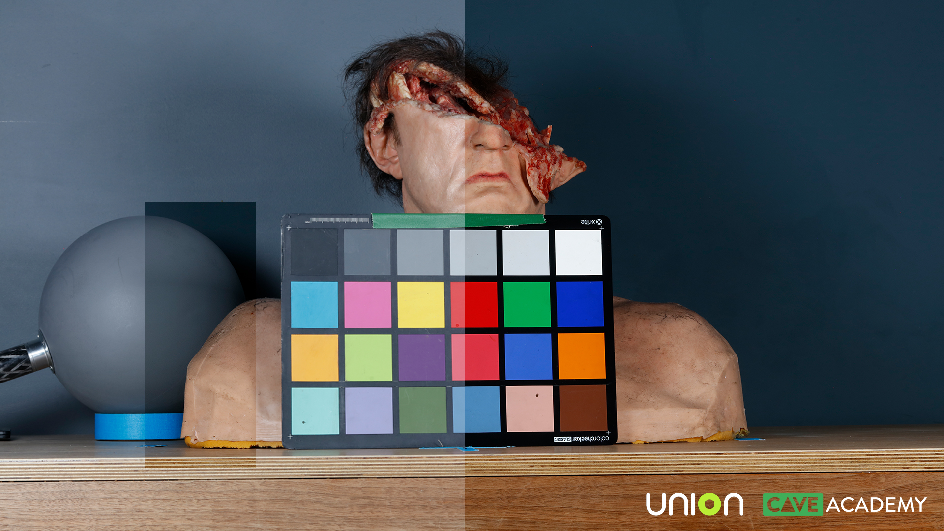
Data Capture Example
In order to break down how to go about using the Grey, Chrome and Macbeth in post, let’s first capture some real-world data.
In this example, I’ve done the following:
- I’ve lit an asset using the house lights (coming in from screen right) and a key light (coming in from screen left).
- I’ve not set up anything fancy with the lighting. Just enough to demonstrate how the reference kit responds to the lighting as I move them around the shoot space.
I’m shooting with the following:
- Canon 5ds
- 50mm prime lens
…and I’m capturing the following shots:
- Asset
- Clean plate (also referred to as empty plate/pass)
- Reference plate (Grey, Chrome, Macbeth)
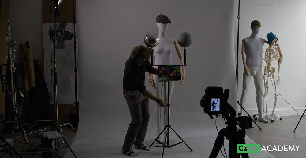
If you have time, you could shoot the reference separately, so one object does not occlude or cast a shadow on the other.

For illustrative purposes (of which we’ll explore below), I’ve also shot the reference kit in different positions. As mentioned above, if a CG asset were to be added that moves around withing the space, then shooting the additional reference shot makes sense. But if the asset is to remain in one position, then just one set of reference images will suffice.
Using the Reference in Post
So now that we’ve captured the data, here are a few examples of how the data can be used. We are not going to go into all the departments who would use the data (for example, Texturing, DMP, Grading, Lighting, etc.) but this should give you the general gist of things.
Firstly and before we continue, please note that I would not usually use Photoshop for any colour related tasks within a production pipeline. Primarily because it is not all too good for colour accuracy, especially when working within an ACEScg colour pipeline. Instead, I would use tools such as Nuke and RawTherepee.
However, I want to doodle over these pics and nothing really beats Photoshop for doodling 😉

As mentioned above, the aim of the game is to use the reference to calibrate our digital scenes to the photographic reference. To do this, we’ll need to build a digital twin of the physical environment (that is the best way anyhow) and then position the HDRI light sources into 3d space, matching the physical light positions. And if you are not matching to photographic reference, you’ll still want to standardise your setups, so your team is working with a calibrated and known dataset.
This is a bigger topic, so I’m not going to go into the nitty gritty of lighting/look dev setup here, but you can check out these upcoming course that will do so:
In a nutshell, we can:
- Use the Grey ball to match light direction, intensity and shadow
- Use the Chrome ball to figure out where things are in 3D space
- Use the Macbeth chart to balance colour and exposure

So that’s it. Or that is how I use the Grey, the Chrome and the Macbeth chart. If you have other ideas, it would be great to hear from you.
But…if you are still rendering balls randomly floating in space, then I’ll be sad. Give your balls some purpose and meaning. Don’t follow the crowd without asking WHY! You know my WHY, so what’s yours?
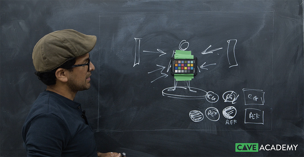
Same Info, Explained Slightly Differently 😉
I recorded the video below a while back and it does cover much of the same info that you’ll read/see above. However, I have decided to have it remain below as it points to some useful examples and references that I would recommend you check out.
Onset Training
For more information on all things onset related, you can check out our courses here:
- Onset Data Acquisition 1001
- Introduction to Cameras and Lenses 1001
- Shooting HDRIs and Panoramas 1001
- Shooting Texture and Look Development Reference 1001
The Connection Programme
If you are a fan of mixing science with art, or maths with creative thinking, then join our Connection Programme, where we’ll be exploring VFX, animation and games from the core fundamentals:
Support CAVE Academy
Here at CAVE Academy the beauty of giving and sharing is very close to our hearts. With that spirit, we gladly provide Masterclasses, Dailies, the Wiki, and many high-quality assets free of charge. To enable the team to create and release more free content, you can support us here: Support CAVE Academy
Amazing article!
In general, to use chrome, grey ball and macbeth chart, is particularly for cg asset that will be integrated to live footage shot , right? That’s the reason we shot a bunch of references as you showed to us.
For cg assets that will be in full cg shot, does not need the balls and the macbeth, because the asset will not be integreted into a real life shot, having nothing to match, right?
Sorry if I’m wrong with that, but does it make sense? Because I saw many artist doing lookdev on assets that will be in full cg shot, using the balls and macbeth having nothing to match in the real world.
Thanks a lot againt. Amazing work you are doing here.
Hi Eliel,
Firstly, thanks for the kind words and glad to hear you found the article useful.
For VFX shots, yes, you’ll want this reference so you can then match it in post with cg assets.
For full CG shots, I would still render the balls and the Macbeth in the shot, this is primarily so you have a starting point. From that point, you can tweak the lights and as you iterate, your supe/lead can very easily compare between the different versions. Also, most full CG shots will be part of a sequence, so you can then use the reference to ensure consistency across the shots in the sequence.
For assets that will go into full CG shots, I would also render the balls/Macbeth within that environment, and then lock that look dev scene down once calibrated. That way, if you have 10 assets to look dev, you would do so within this known look dev setup. In this instance, you are not matching to real-world reference – true. However, you are ensuring all artists are working with the same lighting setup. Otherwise, an artist may tweak a light to make there shaders look better. The overall aim being that for any shader work, the lighting should be fixed and signed off. If not, you’ll be tweaking both lights and shaders and at that stage, you are in a world of pain as you have 2 different variables where things could be wrong.
Also – it could be that you have 10 different assets, but they are of various sizes. For example, let’s say you have 5 humans, 1 TRex, 2 cars and 1 jumbo jet. For such a scenario, I would create a look dev scene for each group of assets, so everything feels relative in terms of scale. I would then set up the lighting using the grey/chrome and Macbeth, so things are lit neutrally. So mid-grey feels mid grey and white feels white (so no colour in the lights). This would be for each look dev setup. Then I would work on the shaders (no tweaking of lights) and once I am happy with all the look dev for each asset, I would pull all the assets together in a master scene to see how they work look against each other.
If all looks good, then into the shot they go. And once they are in shot, we should not tweak the shaders. At that stage, we are shot lighting and “only” the lighting should be tweaked. I say “only” in quotation marks as in reality, you may actually make minor shader tweaks in lighting based on the direction of your supes. Also in real-world shoot, they do actually cheat things too. For example, in car photography, they might wet the car to make it look more reflective and special.
But ideally, our v001 published ‘look’ and ‘light rigs’ have been calibrated. Whether that be for VFX, full CG or games. From that point onwards, you can be as creative as you need to be.
Hope that helps
Thanks
J
Excellent! Now make sense for me! haha Especially in terms of consistency and this part here:
“For assets that will go into full CG shots, I would also render the balls/Macbeth within that environment, and then lock that look dev scene down once calibrated. That way, if you have 10 assets to look dev, you would do so within this known look dev setup. ”
Much appreciated! Thanks!
Hi! I really appreciated the article, it’s very interesting and well explained!
I would like to have a clarification though. I’ve seen some artists putting the chart and the two balls on the renders of their personal work, maybe in their demo reels as character artists or prop modelers. Does it make sense in that case? After reading this article I would say no, unless some real reference is shown alongside, but please correct me if I’m wrong. I think it is useful for a material artist to showcase different materials within the same lighting set, but if the character or the prop you’re presenting is not related to any other work of yours or is not matching any visible reference, there would be no need for consistency, right?
Thanks!
Hi Roberto,
For modellers (or any other asset stage) doing full CG work or personal, I would say it is useful to use the grey/chrome and Macbeth as it allows whoever is reviewing the work to get an idea of the lighting used for the render. For example, I reviewed a project just yesterday, and I was able to say that the lighting is too dark (just by looking at the grey) and therefore, it is hard to see the asset. I was also able to say that their diffuse shader on the model is also way to matte, so we are not seeing how the form turns as everything feels a little flat. But overall – yes, I agree with you, it is not essential. If anything, when used randomly, it just confuses things (which is why I kind of put this page together).
Ideally, an artist would set things up so the render environment for the model is well lit though. Not over lit, but a nice Key, Fill and Rim light. Something that shows off the shape and form of the model (and the textures, the rig, the groom, etc.). Much like a real-world artist would set up some nice lighting for his model before cracking on with the life drawing or painting. A bit of contrast, some brightness, some shadow.
And if you are going for something neutral, where it is important to assess colour, then you’ll want white light. Not coloured light. Even a hint of warm or cool lights can confuse things. Also – having a hint of light will not allow you to assess your textures and look dev accurately. You may be aiming to create some kind of ‘red’ shader, but as you are also adding some ‘blue light’ (for example) into your scene, your ‘red’ may not look as red as you think it should (even though the parameters in your shader are looking correct). You might then tweak your shader to compensate. Maybe you tweak the colour or add a colour correct node to fight things which gets you closer to your intended ‘red’. That is when things get messy. If you were to drop that into a different lighting environment, it might now look freaky as you’ve tweaked the shader so much). So, presenting the grey/chrome and Macbeth allows people to get an idea of your scene.
Once you’ve tested things in a neutral space, you can then introduce other HDRIs or coloured lights to see how your shader responds in other environments. But for your ‘testing’ and ‘tweaking’, you should do this in a controlled environment. Much like a scientist doing clinical tests and then moving on to live tests.
So, in a nutshell, if you are not matching directly to reference, then present your model within a nicely lit environment. With or without the reference – up to you. I personally would go ‘with’ as it allows the reviewer to get a sense of the lighting used in the scene.
But if you are doing multiple assets (of the same size), then render them all within the same space, and I would then definitely render the grey/chrome and Macbeth to show lighting consistency and that all the models can be assessed fairly.
And then if you are doing and surfacing work (texture, groom, look dev), then definitely yes. I want to know what the environment is like that you’ve been creating these shaders in and what the lighting is like in your additional lighting environments.
That’s my 2 cents – although it’s more like 20 cents 😉
Be great to hear what others think.
Thanks
Thanks a lot for your detailed reply! Very helpful!
Thank you for valuable contribution what i looking for.
You are welcome Neel.
Thanks so much guys. This is so useful.
Thanks Sam. You are welcome.
The RAL number stands for the color in the paint industry. Well, I’m interested in your opinion, which RAL color should be used for painting the gray color?
According to the RAL designation, RAL 3037 is closest to the middle gray – https://www.ralcolorchart.com/ral-classic/ral-7037-dusty-grey
Here are a few more links with some RAL color testing:
https://www.entracte.it/?p=353
https://www.entracte.it/?p=531
Hi Zlatko,
I’ve not used RAL values, so would need to do some testing. I usually recommend a paint from Rosco, however, I cannot find a link to it at the moment. It was Rosco or another brand that matched the mid grey on teh Macbeth (or maybe I dreamt it). I do recommend the VFX Store mid grey. It has been set up to match the 18% Kodak grey: https://www.vfx-store.com/product-page/grey-paint
…So you’d have to be aware when setting up your digital grey that your grey sphere will be 0.18 grey and they grey swatch if using the Macbeth will be 0.191.
Or, you’d used a spectrometer when using your paint to get it to match 0.191. I’m guessing most grey balls are simply not mid-grey and would need to be tested. But they are still extremely useful as a guide to match exposure and colour. An artist should just be aware of these real-world imperfections.
Thanks
J